Make it scannable.
I gave key instructions room to stand out.
A visual standard for the wine section.
Explore the documents ↓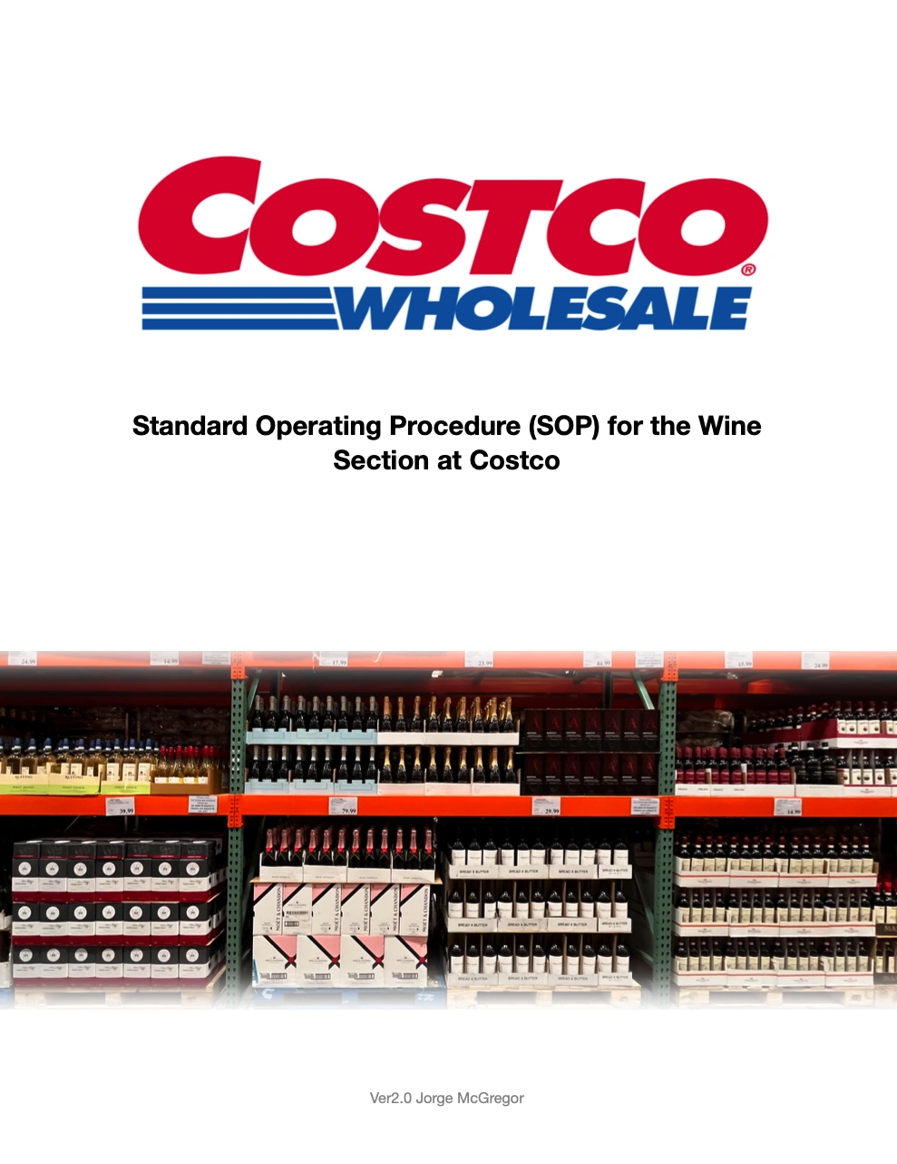
I designed a practical guide for the Costco Gloucester wine section: visual standards, daily routines and a planogram.
I brought display guidance and recurring tasks into one easy-to-follow reference.
My focus was clarity: help the team find what they need, understand it quickly and come back to it later.
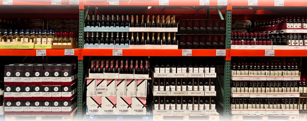
I used bold headings, numbered steps and photos to make the guidance easy to scan.
I carried red and blue through the callouts and kept the instructions short and direct.
I gave key instructions room to stand out.
I paired photos with diagrams so the team could see the standard.
I connected daily checks, planning and upkeep in a repeatable flow.
I mapped the aisle with colour-coded wine sections, lettered bays and an end-cap view.
This was a planning example, built to make placement and category decisions easier to discuss.
Take a closer look at the five pages below. Tap any page to enlarge it.
This is my Version 2.0 project document, rather than a current company-wide policy.
I help turn everyday information into something people can actually use.
Discuss a project ↗